


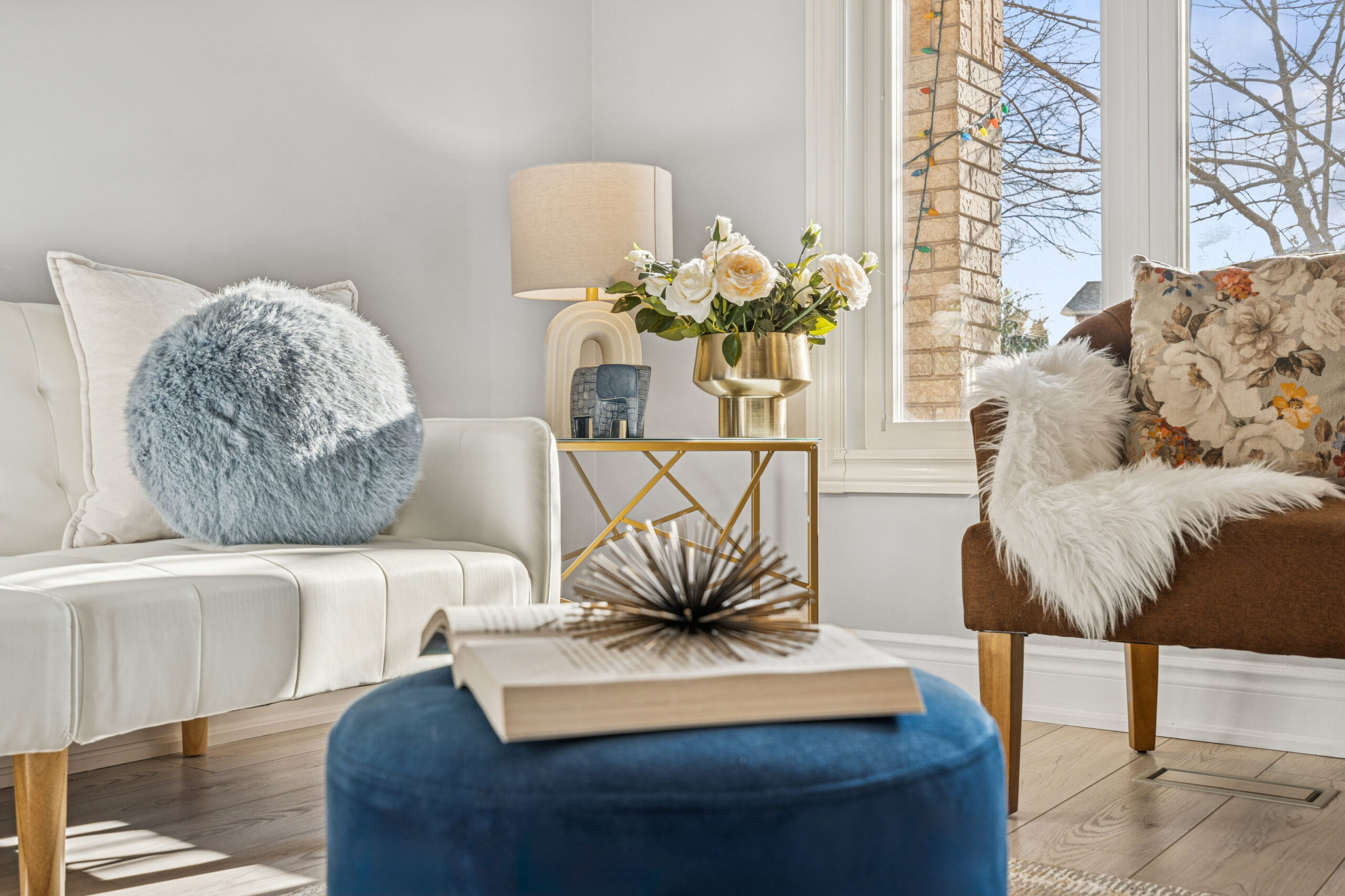
Designers and homeowners alike are increasingly drawn to cutting-edge painting techniques that enhance architectural details and elevate everyday environments. One such remarkable trend is color capping—a subtle, sophisticated way to bring dimension and polish to any room.
What Is Color Capping?
Unlike bold, uniform color drenching, color capping creates a tonal gradient by layering shades from the same color family: the lightest on the walls, mid-tone on the trim, and the darkest across the ceiling. The result? A seamless flow that accentuates volume, draws the eye upward, and makes spaces feel taller and more intentional.
Why Designers Are Embracing It
Industry pros like Helen Shaw, Nina Lichtenstein, and Ruth Mottershead highlight color capping’s versatility—it enhances both classic and contemporary interiors. Whether in jewel tones or neutral palettes, the technique adds refined depth while remaining approachable and sophisticated.
As the interior design landscape continues evolving, this trend aligns perfectly with modern preferences for layered, curated environments that feel both richly styled and welcoming.
Casa Elegance: Elevate Spaces with Intentional Color
At Casa Elegance, we’re inspired by design trends that celebrate subtlety and craftsmanship. Color capping is more than just paint—it’s a design philosophy.
-
Highlight Architectural Details: Whether you have ornate crown molding or sleek modern trim, color capping brings out these features with refined layering.
-
Elegant, Cohesive Style: Choose tones that blend softly, creating a monochromatic look that’s far more dynamic than flat, single-color walls.
-
Perceptual Magic: Lighter walls paired with deeper-toned ceilings give rooms a sense of openness and height, perfect for intimate or compact spaces.
How to Choose the Right Shades
1. Pick a Base Color: Start with a paint shade that complements the room’s mood—soft greys, warm taupes, or subtle pastels work beautifully.
2. Select Two Complementary Shades: Go one shade darker for trims and molding, and two shades deeper for the ceiling for visual depth.
3. Texture & Lighting Matters: Matte or eggshell finishes for walls create a soft glow, while satin or semi-gloss on trims offers contrast. Proper lighting enhances the gradient effect.
4. Unify with Furnishings: Carry the same tones into furniture, textiles, and accessories to create a layered, intentional design story.
Inspirational Applications
-
Living Rooms: Use warm neutrals or moody hues for a welcoming yet stylish ambiance.
-
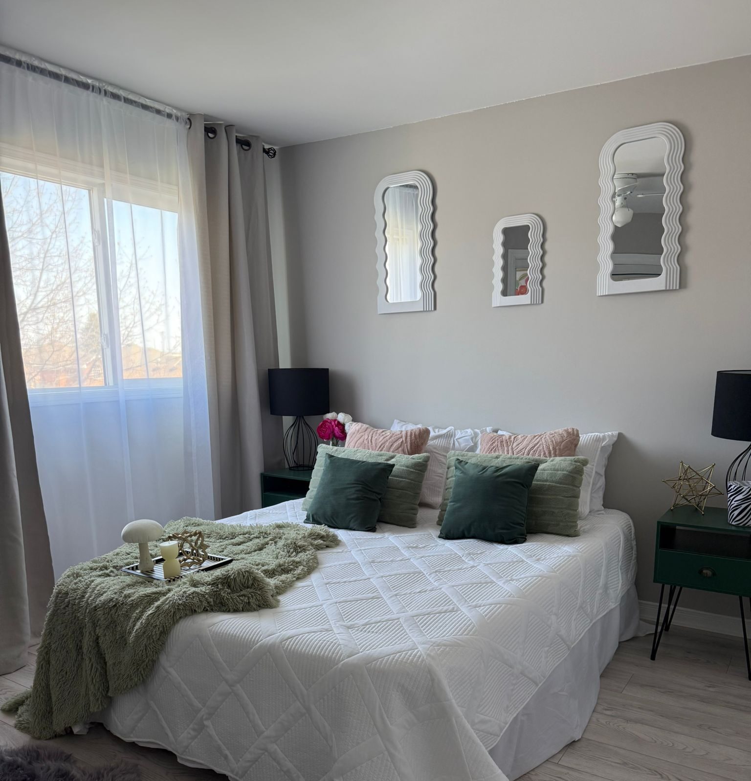
Bedrooms: Soft pastels with darker ceilings create calming, cocoon-like sanctuaries.
-
Home Offices: Neutral gradients promote focus and sophistication—perfect for productive environments.
Expert Tip
Want more than paint? Pair color capping with subtle paneling or textured wallpaper to elevate the depth and character in your space.
0 Comments